![[Previous]](/file/27280/Best Tools for JAVA.iso/HTMEDITR/HTMLAUTH/PREVBUT.GIF)
![[Top]](/file/27280/Best Tools for JAVA.iso/HTMEDITR/HTMLAUTH/TOPBUT.GIF)
![[Next]](/file/27280/Best Tools for JAVA.iso/HTMEDITR/HTMLAUTH/NEXTBUT.GIF)
The INPUT is the basic form element. It is available in a number of types. HTML Author supports the following types of INPUT element:
| Type | Appearance | Usage notes |
|---|---|---|
| Text |  | Single line text input. |
| Password | 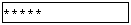 | Password input - as above, but a dummy character (e.g. asterisk) is displayed in place of each character type. |
| Radio Button |  | If several radio buttons are given the same name, only one can be selected at once. (Equivalent to a single choice select element.) |
| Checkbox |  | If several chackboxes are given the same name, any number may be selected at once. (Equivalent to a multiple choice select element.) |
| Submit button |  | The user presses this to submit the contents of the form. |
| Reset button |  | Resets the form elements to their initial values. |
The following attributes for the fields may be defined in the dialogue box for input elements: Type, Value, Size and Name.
Select elements allow the user to select from a list of choices. They are available in two types:
| Select Type | Appearance | Usage notes |
|---|---|---|
| Multiple Choice |  | A selection list in which several options may be selected at once. |
| Single choice |  | A selection list in which only one option may be selected at once. |
The dialogue box shown below is used to define the details of the select element:
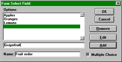
New options may be added by typing them into the Editing field, adjacent to the Add button, then clicking on the button or pressing Alt-A. They are placed at the position of the currently highlighted option. The highlighted option may be moved to the Editing field for editing by pressing the Edit button, or deleted completely by pressing the Remove button.
Text area elements are used to input text consisting of more than one line. It is displayed in HTML Author as a single, multi-line text box with vertical and horizontal scroll bars. It has parameters: Default Text, Rows, Cols and Name. The Rows and Cols attributes are used to specify the depth and width of the box in nominal character dimensions.